BlueHelix
Branding / Art Direction
Insight
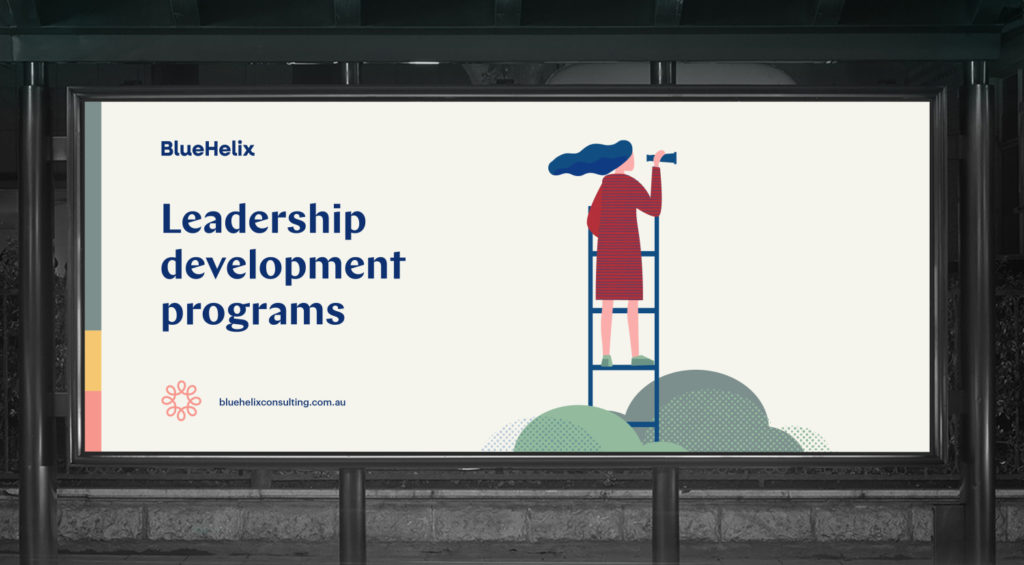
BlueHelix provides bespoke programs purposely designed to achieve both individual and collective leadership for achieving strategic priorities. BlueHelix have a genuine passion for human potential.
Solution
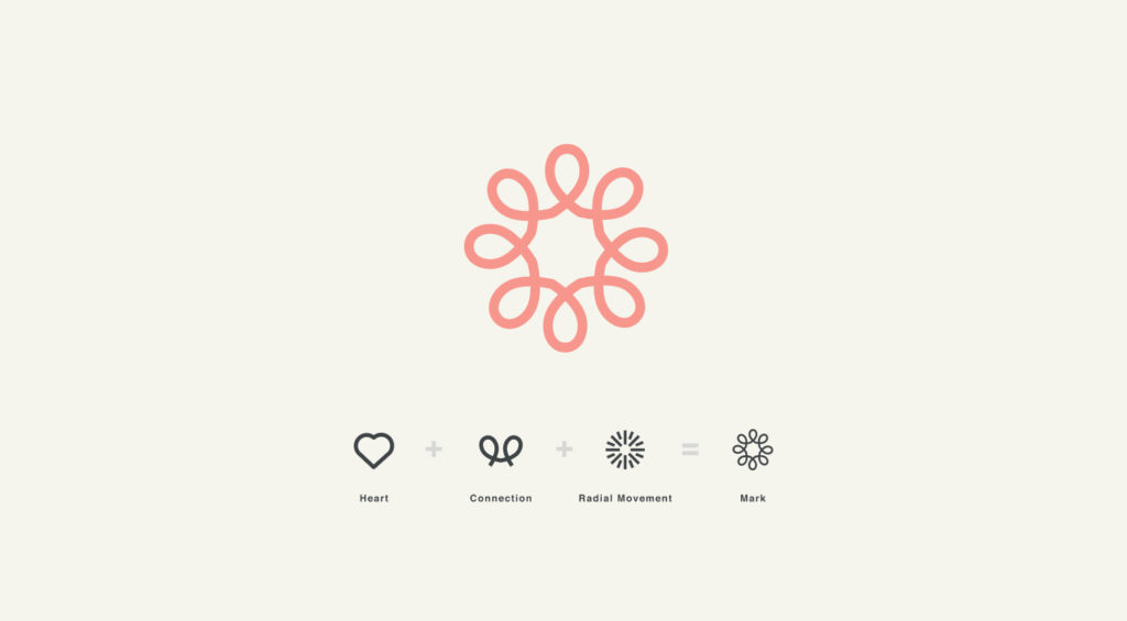
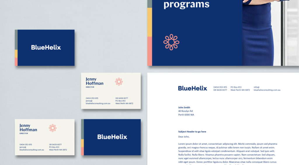
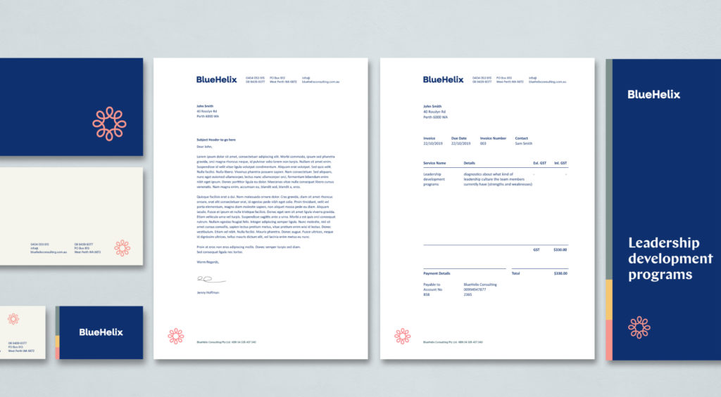
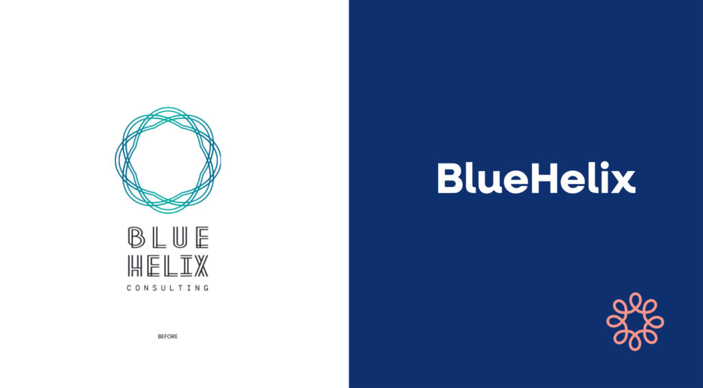
The rebrand reflects a more calm and connected brand. The logotype is modern and progressive and the brand mark reflects the ‘connection with the heart and inner self’ by using connected hearts in a radial movement. The blue denotes corporate sector, while the rest of the colour palette evokes a calm yet vibrant and uplifting feeling.


Credits
Branding, Design & Art Direction
Distl
Client
Local eBoards